Pentathlon GB Launches Penta+, the New Multi-Sports Brand to Inspire Athletes and Sporting Fans
Pentathlon GB, the national governing body for the Olympic sport of Modern Pentathlon, has introduced a new multi-sports sub-brand called Penta+. This launch comes after the International Olympic Committee confirmed that Modern Pentathlon will remain a part of their program for the Los Angeles 2028 Games.
The objective of Penta+ is to attract and engage a new generation of athletes and sporting fans. It is a separate brand from the governing body and aims to modernize the organization as a multi-sport provider, while also reflecting the diversity of its audience. Its primary focus is to encourage recruitment and participation from individuals of all ages and abilities. The brand expression “Be Brave. Be More.” embodies the ethos of the active athlete community that Penta+ strives to create, characterized by accessibility, dynamism, bravery, and fun.
Pentathlon GB, an organization rooted in ancient Olympic Games, is now celebrating its 100th year since its modern revival. With an ambitious strategy for the future, the organization aims to expand its relevance, engage with diverse audiences, increase medal count, and ensure long-term sustainability.
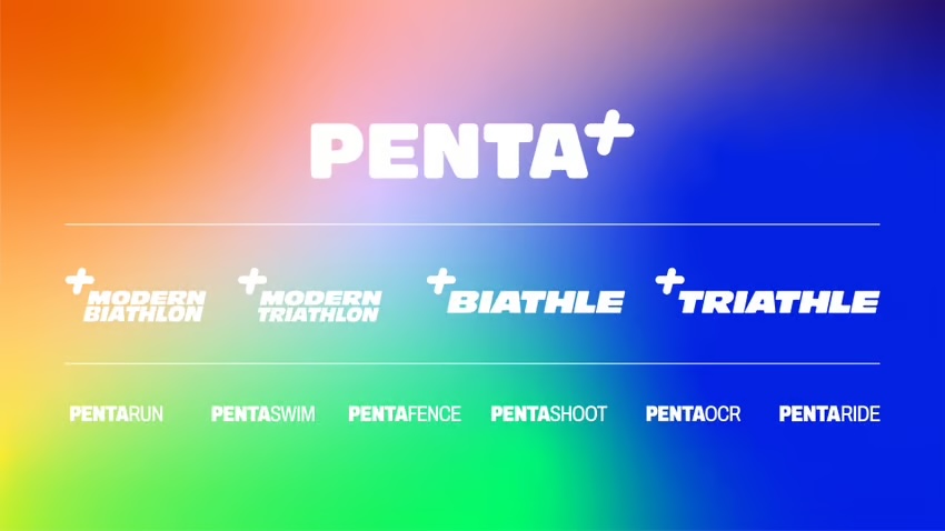
The name Penta+ represents the various disciplines within the sport, including Penta Run, Penta Swim, Penta Shoot, Penta Fence, Penta Obstacle, and Penta Ride. It highlights the infinite possibilities available to athletes, who can customize their experience by selecting the components they find appealing. This flexibility facilitates increased participation and inclusivity.
The Penta+ brand can be used as a flexible brand hierarchy that highlights the individual sports and how they combine to create competitions like Modern Biathlon, Modern Triathlon, and Modern Pentathlon. Additionally, the brand reflects the introduction of a new discipline (obstacle sports) and the expansion from five to six sports.
The visual identity of the Penta+ brand demonstrates the theme of “doing and being more” through active and assertive photography that showcases athletes of all levels realizing their potential in both sport and life. The color palette, inspired by Pentathlon GB’s original colors, utilizes gradients to signify the diversity of sports offered and the commitment to equal representation. The + symbol has been abstracted to create a dynamic graphic system of static and movement-based patterns, which can be used to frame and overlay content, resulting in a visually striking and ever-moving visual system unique to Penta+.
The Penta+ branding extends beyond the visual identity and encompasses athlete kits, merchandise, event staging, and communication. These elements aid Pentathlon GB in engaging with a wider audience and expanding its reach.
CEO of Pentathlon GB, Trafford Wilson, expressed his excitement over the rebrand, stating that it is a pivotal moment for the organization. He emphasized the importance of dispelling misconceptions surrounding the sport and making it accessible to everyone. Wilson believes that Penta+ embodies the commitment to the evolution of the sport and effectively communicates that message.
The brand strategy, visual identity, and logo were developed by creative agency Household. Executive Creative Director at Household, Matt Michaluk, expressed their privilege in working with Pentathlon GB to create an inclusive brand that fits the current world. The partnership focused on rebranding while also addressing key messages of equality, positive change, and community. They are proud to have modernized one of the oldest sports in the world, welcoming new generations of fans and celebrating the uniqueness of this multi-sport.


